Premise:
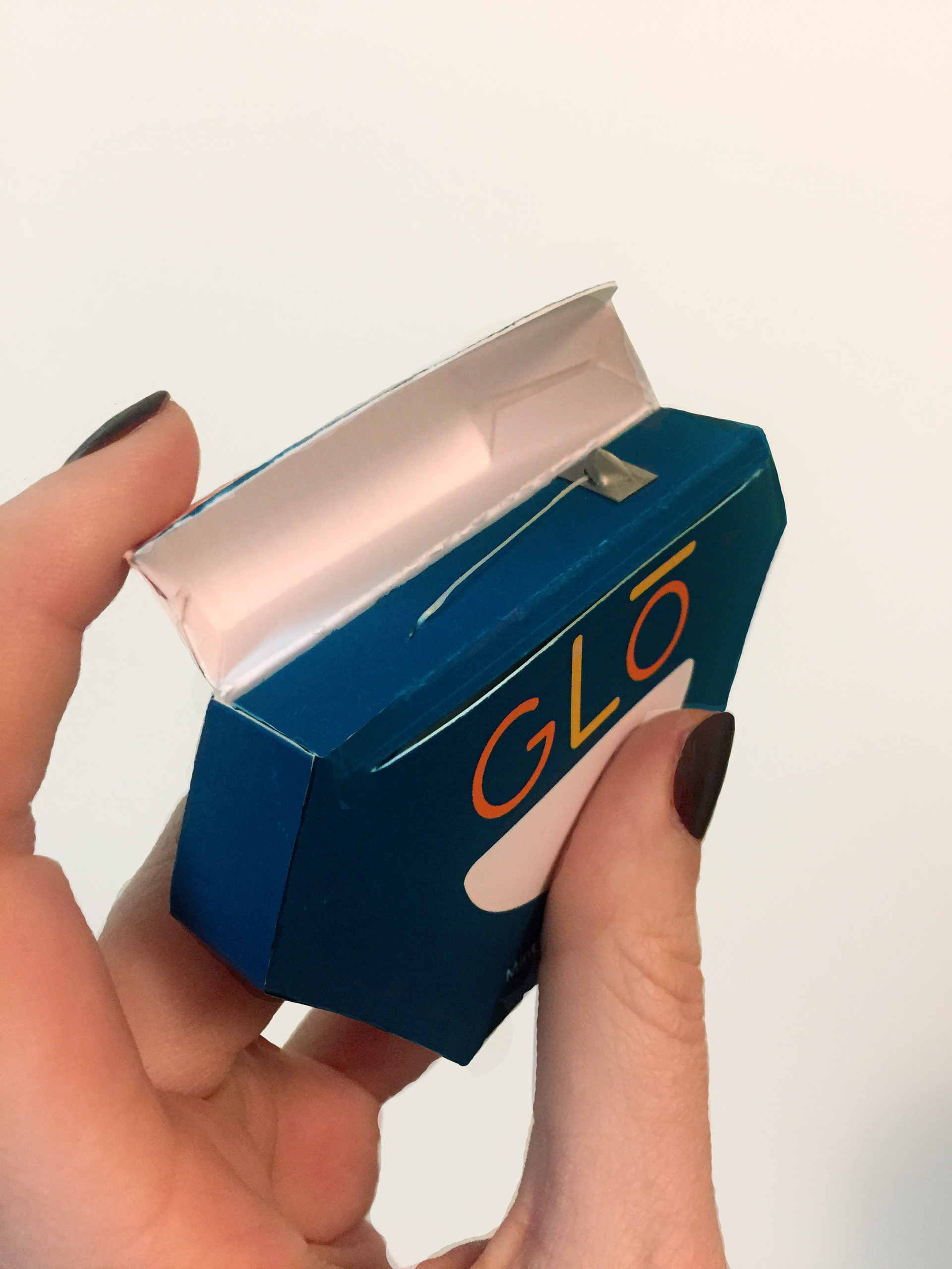
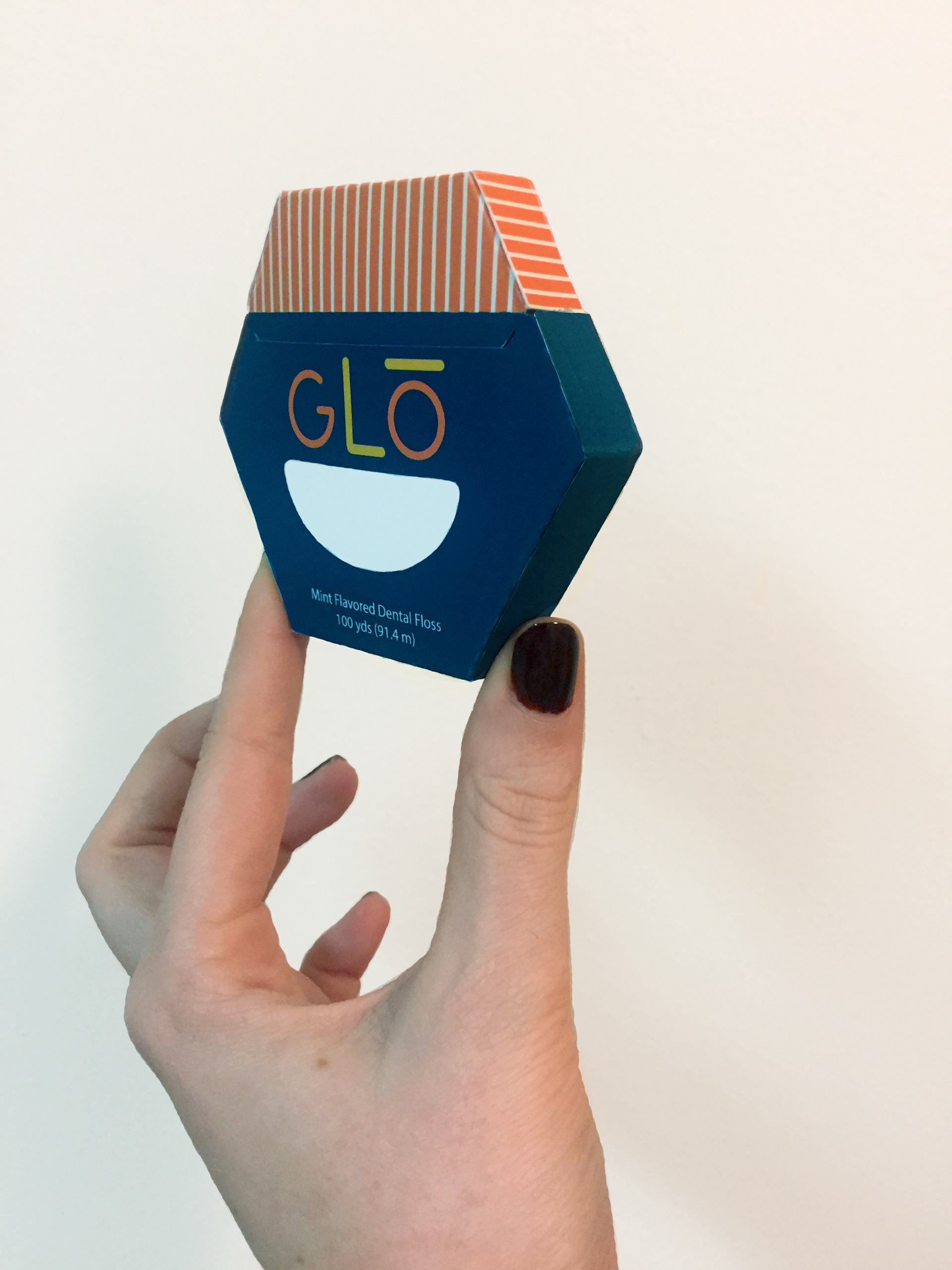
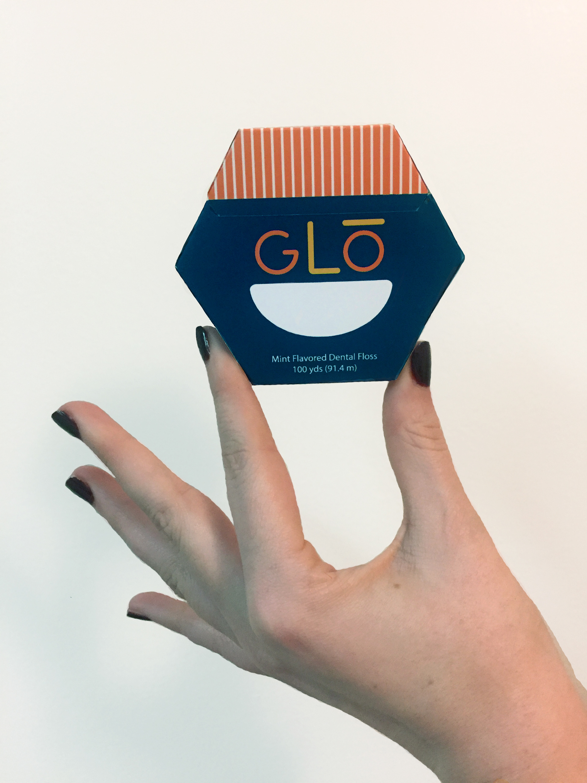
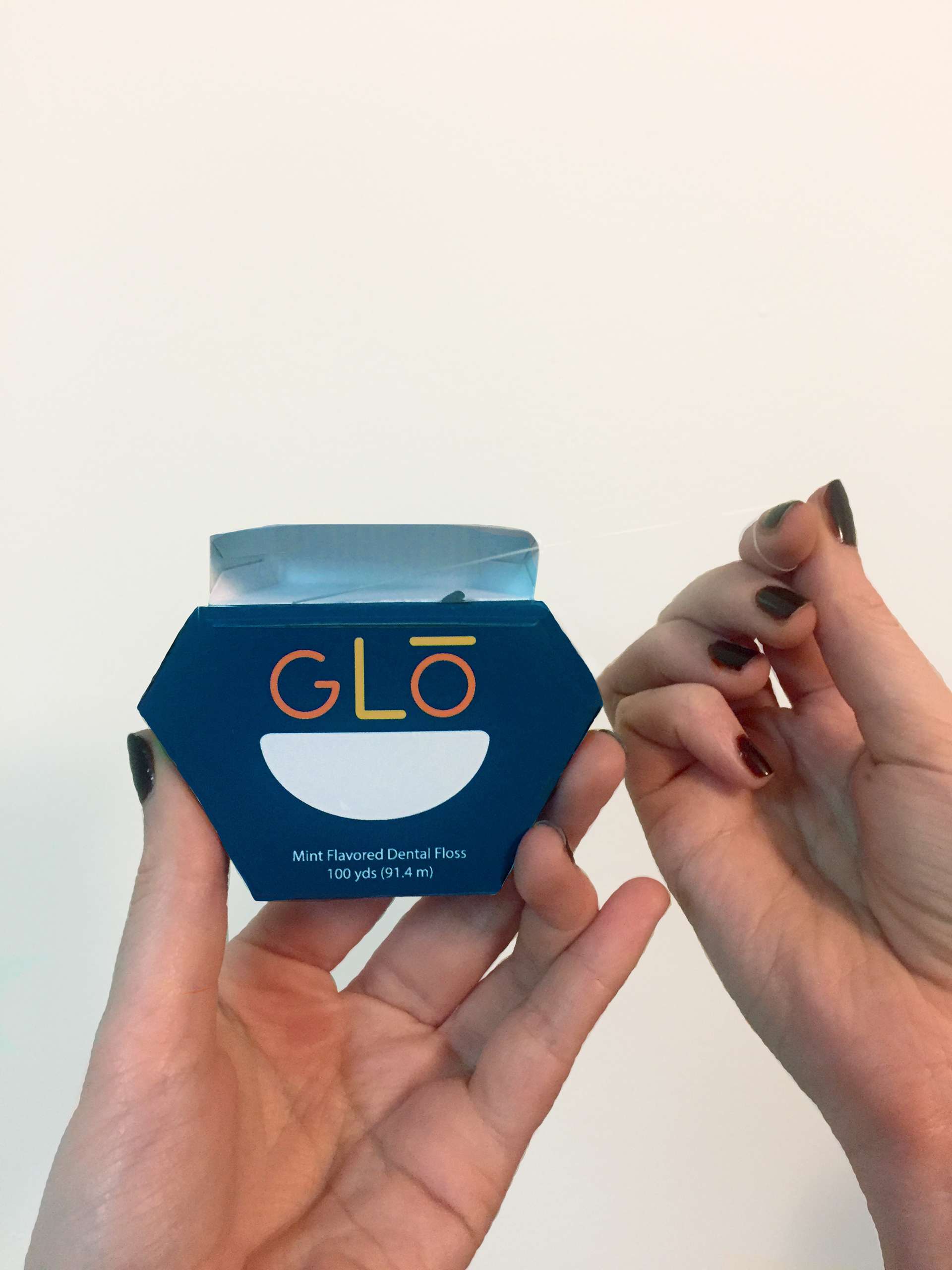
The goal of the rebrand was to bring the packaging into the modern age, moving from a basic, white plastic box to a vibrant, sustainable paper box. The target audience remained GoodSense's demographic of families looking for quality, affordable healthcare. Clean lines, a graspable shape (for younger children), and playful colors came together to produce a product which parents would be confident purchasing and kids would reach for.
Challenge:
Working from a relatively clean slate made the branding portion of project really fun. The difficulty came with the construction of the packaging. I knew I wanted to make a paper box that could be recycled or composted, and move away from plastic.
My initial plan was to create a circular package that would follow the curvature of the logo's smile. This proved too difficult to manufacture due to the dieline for the sides, and resulted in an impractical shape for placing upright on shelves or sinks. I wanted to keep the shape unique, but compact, so the final design became hexagonal, with two more sides than a classic floss box.
Solution:
Below, you can see the process for branding Glo in the brand guidelines, including user research, competitor analysis, and iterations of the final design.
With an updated package, bright new colors, and a lower production cost per paper package, Glo transformed into a fresh, fun, family-friendly brand, while keeping its values of cost-effectiveness and trustworthiness intact.
