Tally only accepts applicants with a credit score of 660 or above, and is best used by those who struggle to pay more than the minimum payment. This leaves out 80% of potential users struggling with credit card debt who don't quite meet the rigid requirements to apply for help.
As the potential solution to this, Tally unveiled Tally Save, a savings app that rewards you for saving, and helps you funnel your savings toward paying your credit cards. Once a user was in the Tally universe, they could more easily shift over to Tally Cards once their credit score is high enough to qualify.
Unfortunately, Tally Save was cut short in the midst of Covid-19, but the thought and design behind the product will be integrated with the flagship app.
Lifecycle
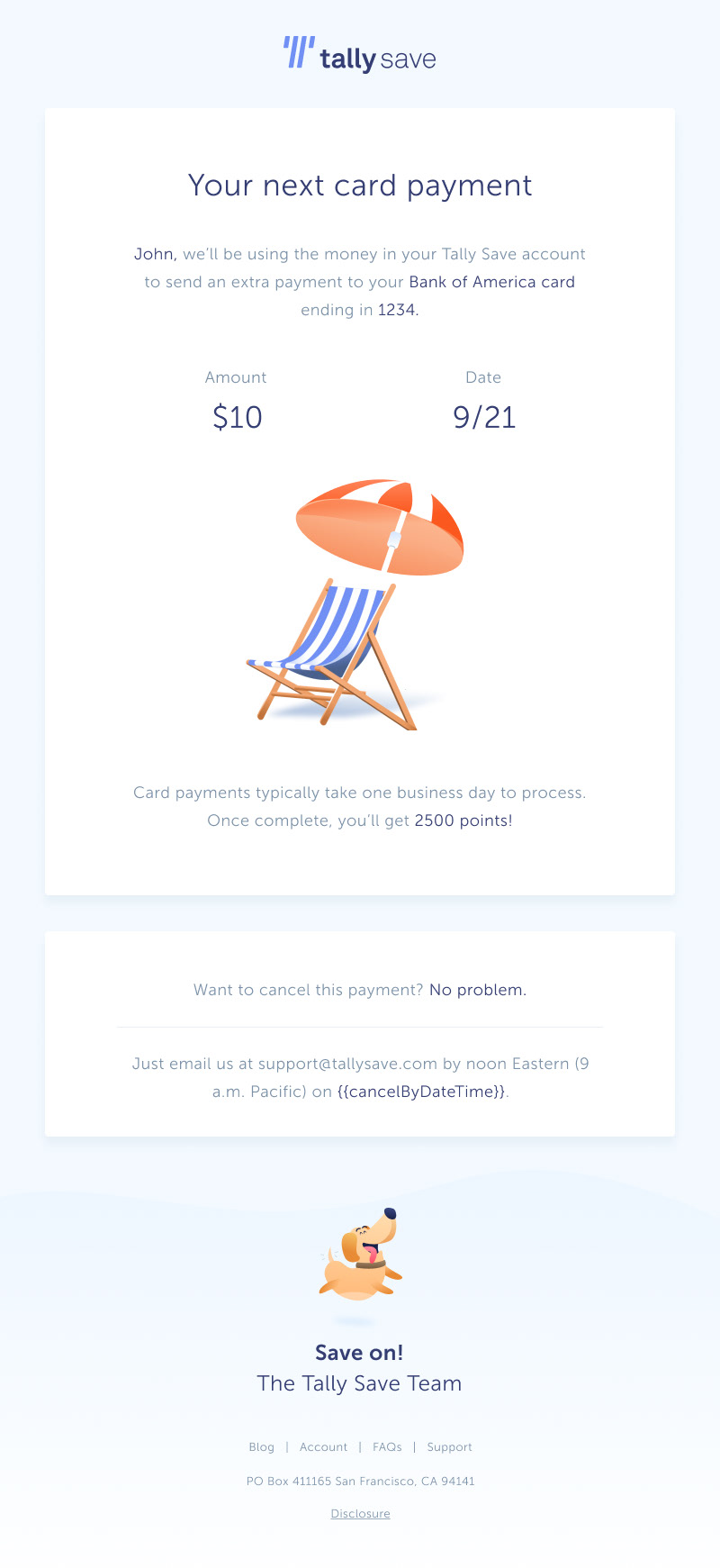
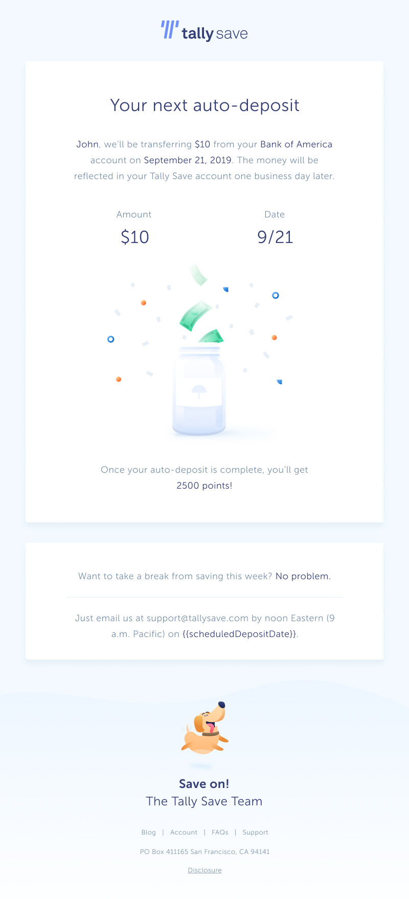
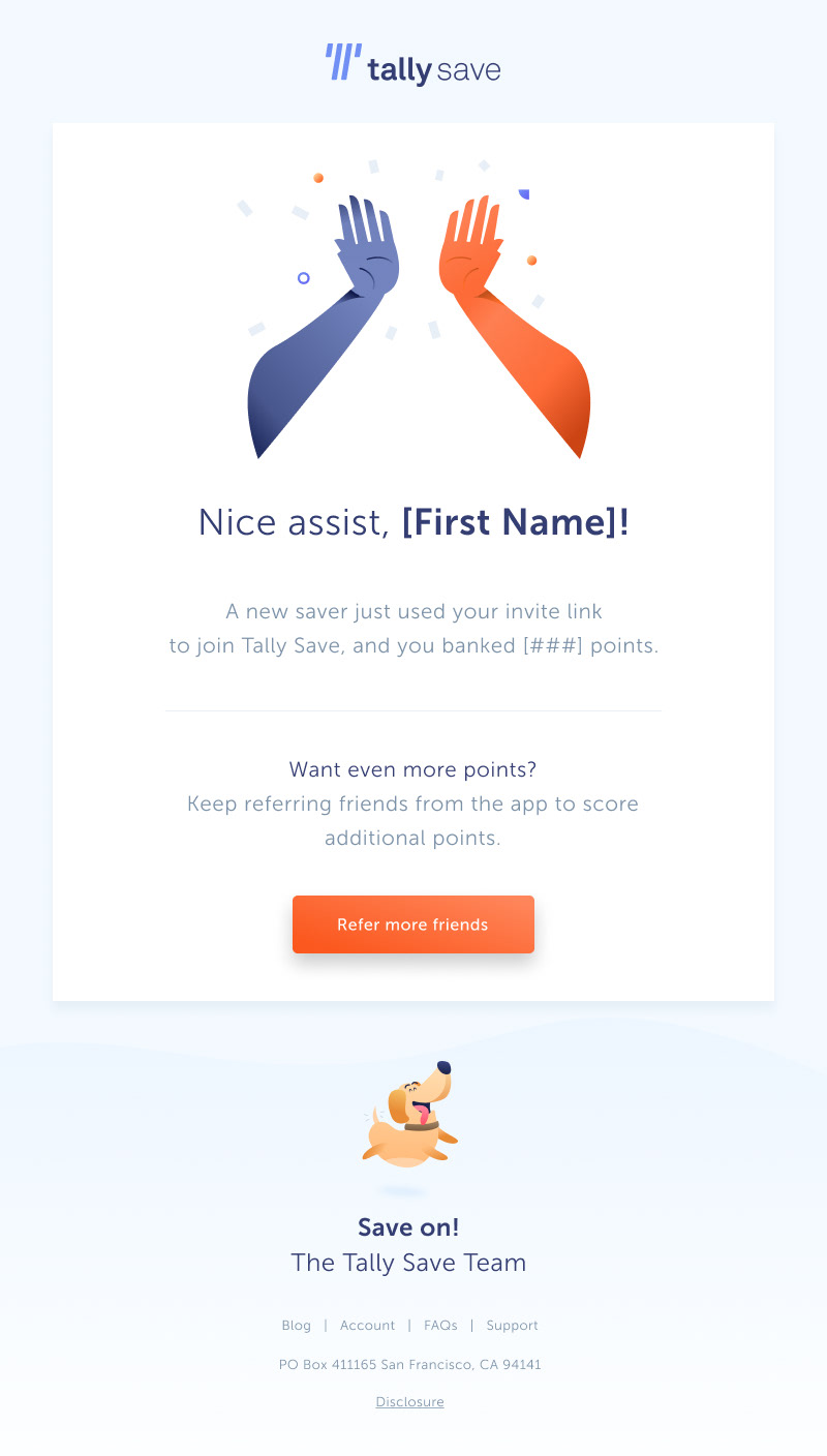
I joined Tally as the sole marketing designer, focusing primarily on the launch efforts behind Tally Save. One pivotal piece in the launch of the app would be our lifecycle emails, as one of the few user engagement tools in an automated financial app.
By leveraging typographic hierarchies and spot illustration, I was able to focus in on the main information a user is looking for—what is happening to their money and when. The illustrations and backdrop help to bring more color and interest to an otherwise dense email, and the tiles provide a simple way to divide information. The final details came through in the FAQ and footer: subbing the heart for our mascot Otto (a user favorite) and providing more opportunities for users to connect, get answers, and view the neatly tucked away disclosure through our web link.
Welcome Email Before & After
Original
Revised
ASO
App Store Optimization is one of my specializations, and one of my all-time favorite channels to work within. Being a brand-new app, Tally Save was a completely clean slate, and I was able to work from the ground up.
The main task for this project was to identify our top value propositions and best in-app screens to put forward on the storefront, using learnings from user research and competitor analysis. What set Tally Save apart from other savings apps was its unique rewards system, designed to encourage users who struggle with saving regularly to start setting aside $5 a week, earning them points toward gift cards ranging in value from $5 to $200.
Initial Design
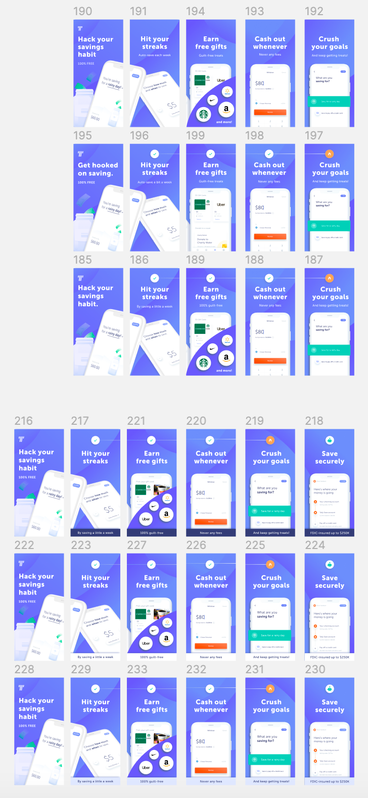
Final Design
Ad Campaigns
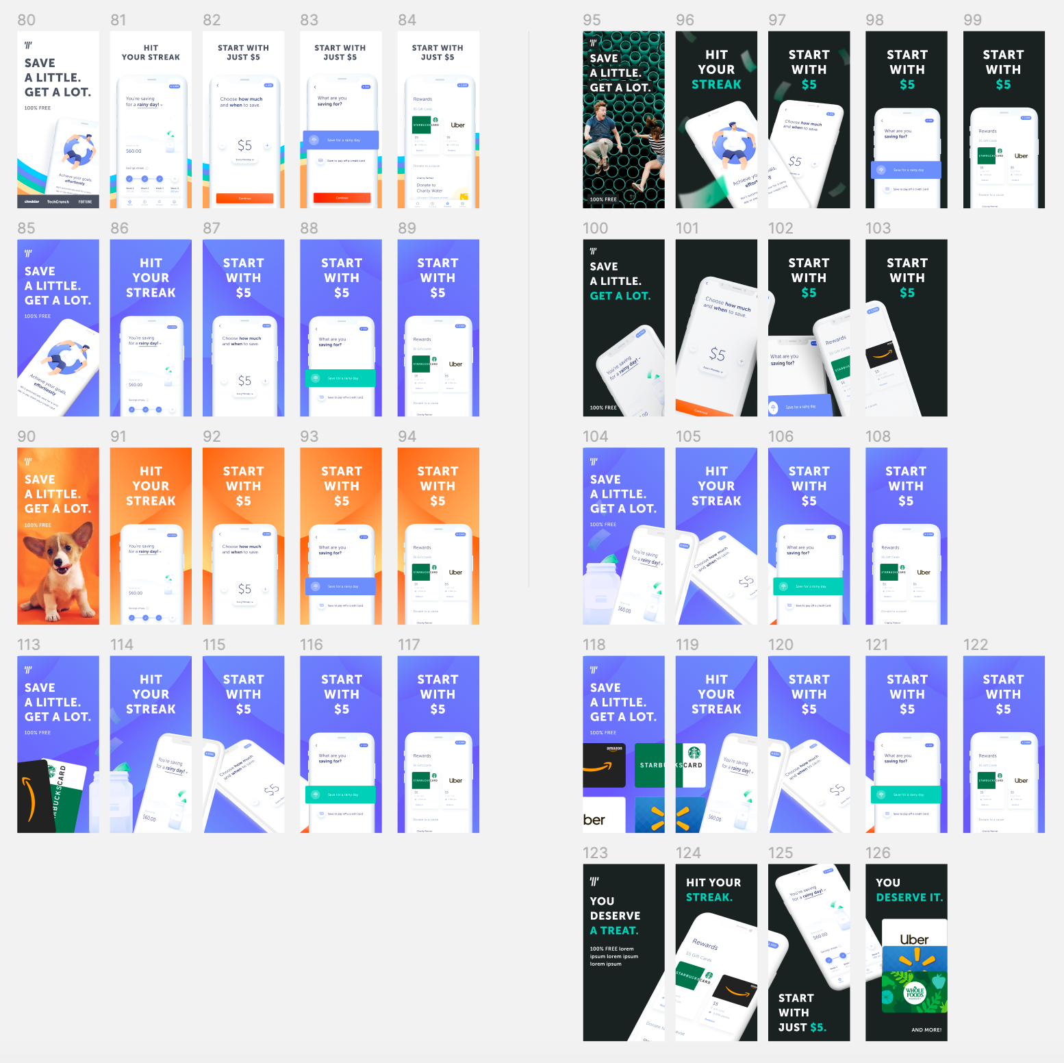
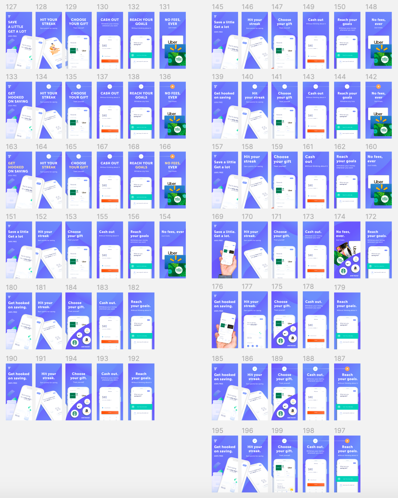
Before launching Tally Save, I worked closely with our Head of Design, Product Marketing Manager, and Growth team to brainstorm and develop our first round of creatives. Below you can see the evolution of creatives as we phased out the first batch and ushered in the campaigns to match and revitalize Tally Save shortly before sunset.
The following videos are from the second batch of creatives that aimed to put rewards center stage and test current trends in varying styles to identify the optimal positioning for Tally Save.
One creative explored a new Facebook ad feature called Instant Experiences, a "landing page" middle-man between the ad and App Store that can be utilized to provide that last push of information if the user is not convinced. Upon testing this feature, we found that users averaged 20 seconds viewing the feature after clicking the ad—much longer than the usual 3-6 seconds!
