VIP ReDesign
Premise:
In 2017, I was asked to redesign the VIP system, coinciding with the launch of VIP across all four of Product Madness' apps. The redesign would create a single, global identity for VIP that would be instantly recognizable, no matter which app you were playing, and flow together in a sequence.
Challenge:
One issue that the VIP team was dealing with was that users were skipping over or exiting out of their pop-ups because they could not differentiate between VIP content and the generic in-game pop-ups. They wanted to elevate the overall user experience to be more luxurious and in line with what you see in similar apps' elite clubs.
Solution:
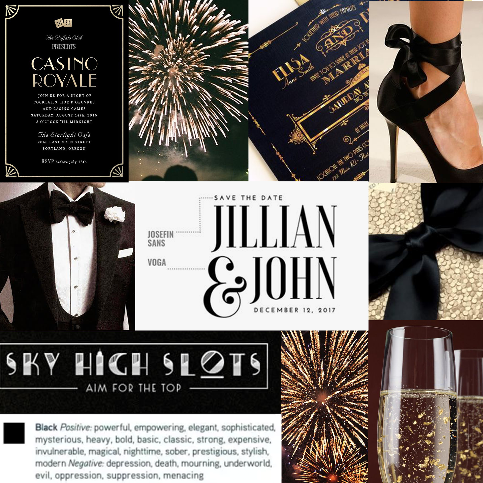
Black Tie

Decadent
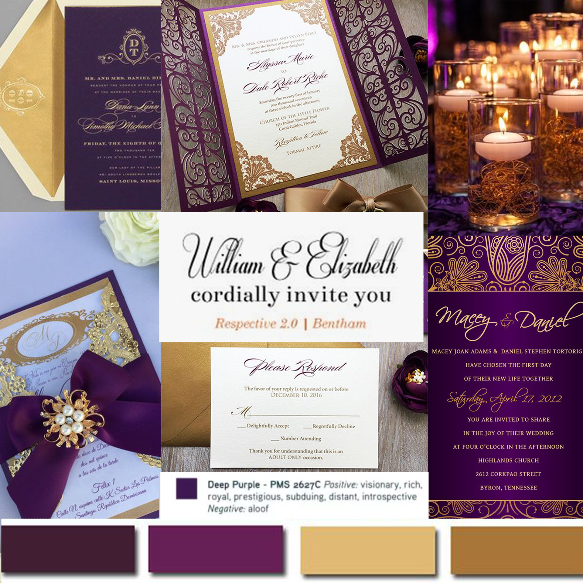
Elegant
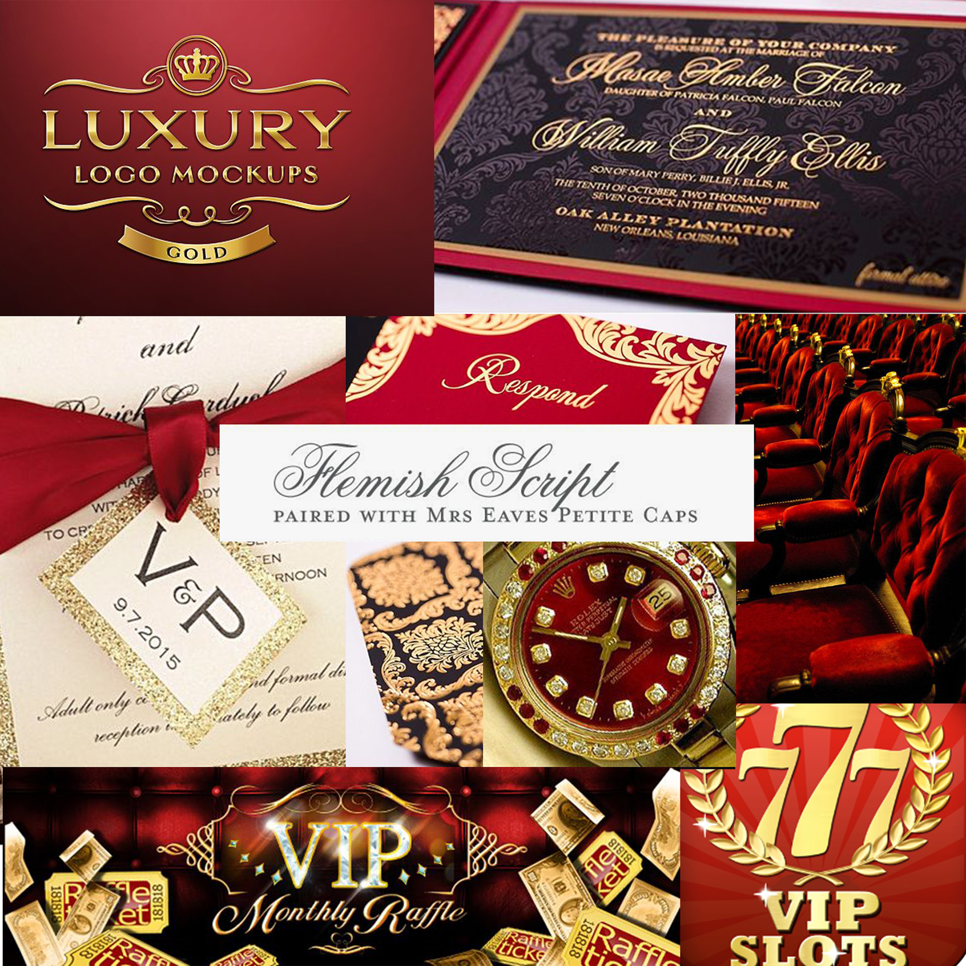
Regal
My first step in redesigning VIP was to create four distinct art directions for the Head of Creative, Marketing VP, and VIP managers to choose from. Each direction took a different approach to exclusivity and drew inspiration from luxury goods, indulgent parties, and even lavish wedding invitations.
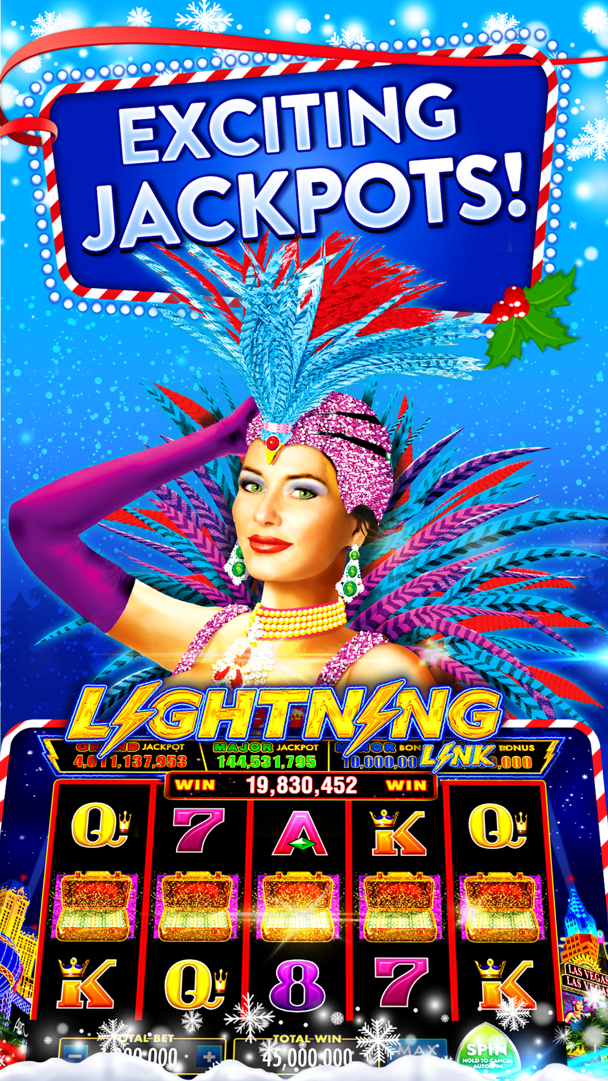
The final decision was to move forward with "Elegant", a candlelit, purple and gold style with abundant flourishes, sparkles, and ribbons.
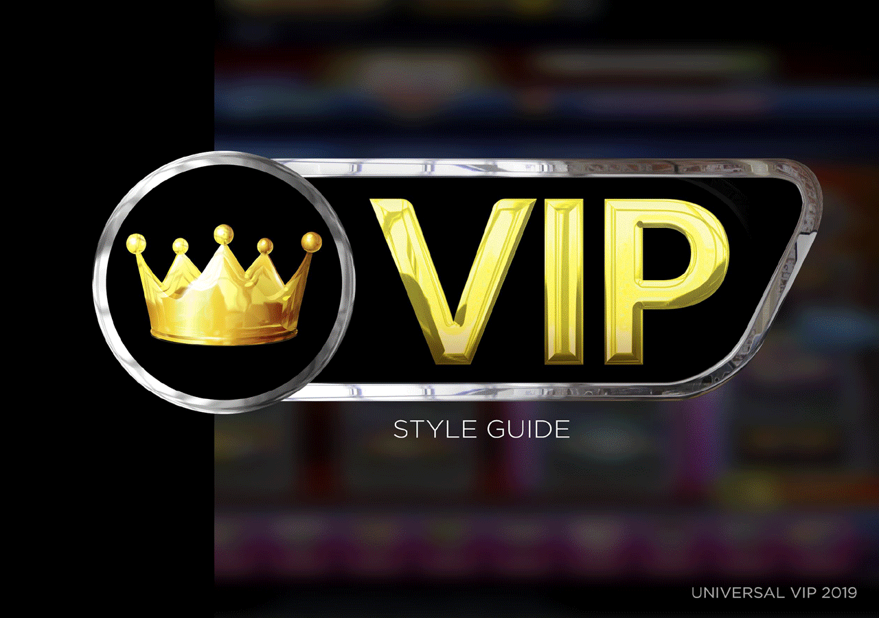
Universal VIP Style Guide (Updated in 2019 by Antonia Tribuzi)
After redesigning VIP, I was the VIP design lead for a few months before passing the torch to designer Antonia Tribuzi and transitioning to a supervisory role.
She created several of the CRMs in the style guide, as well as the email template below, based on the redesigned style guide.
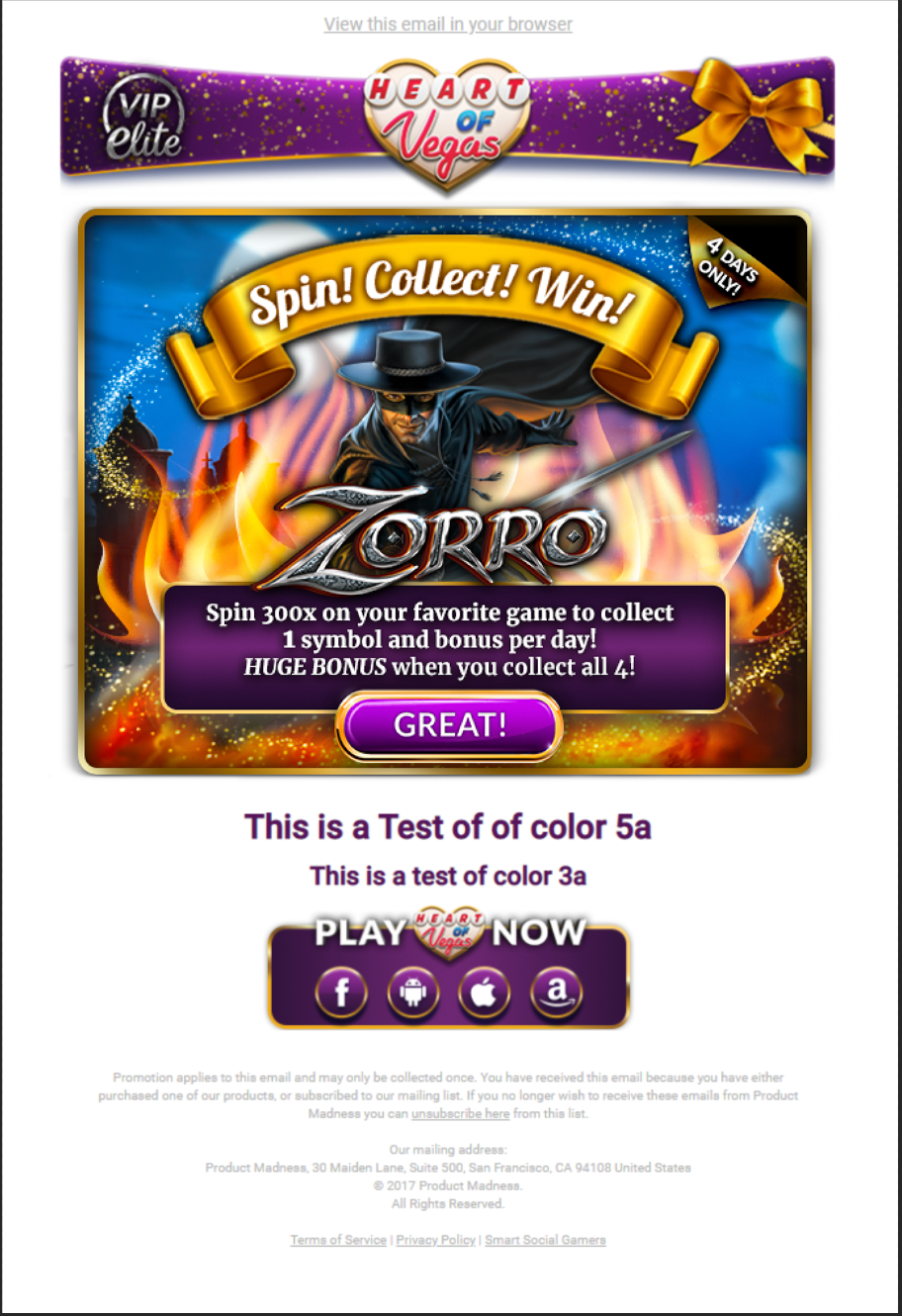
Email Template
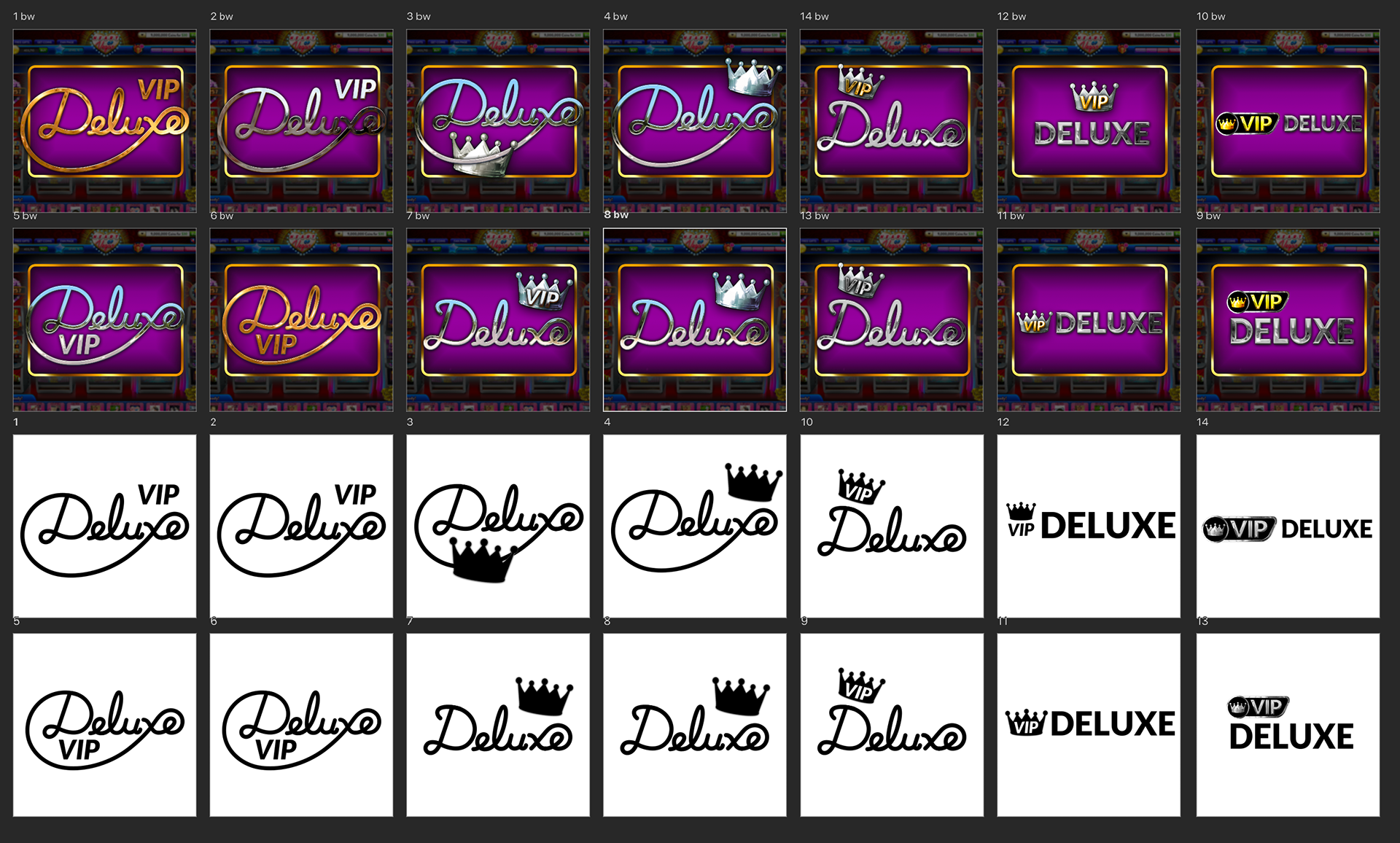
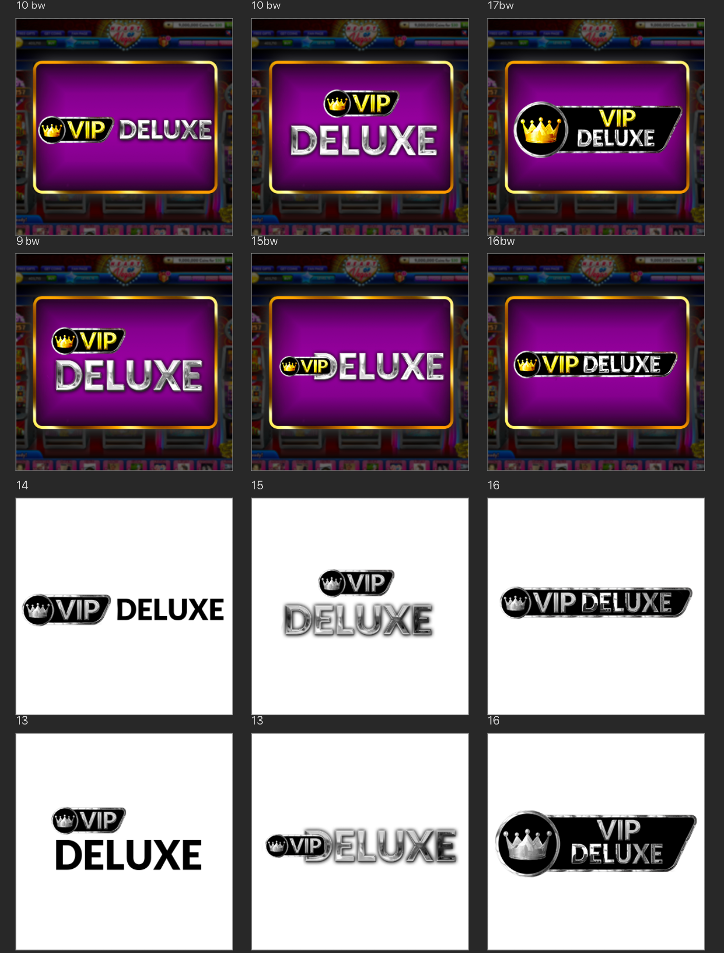
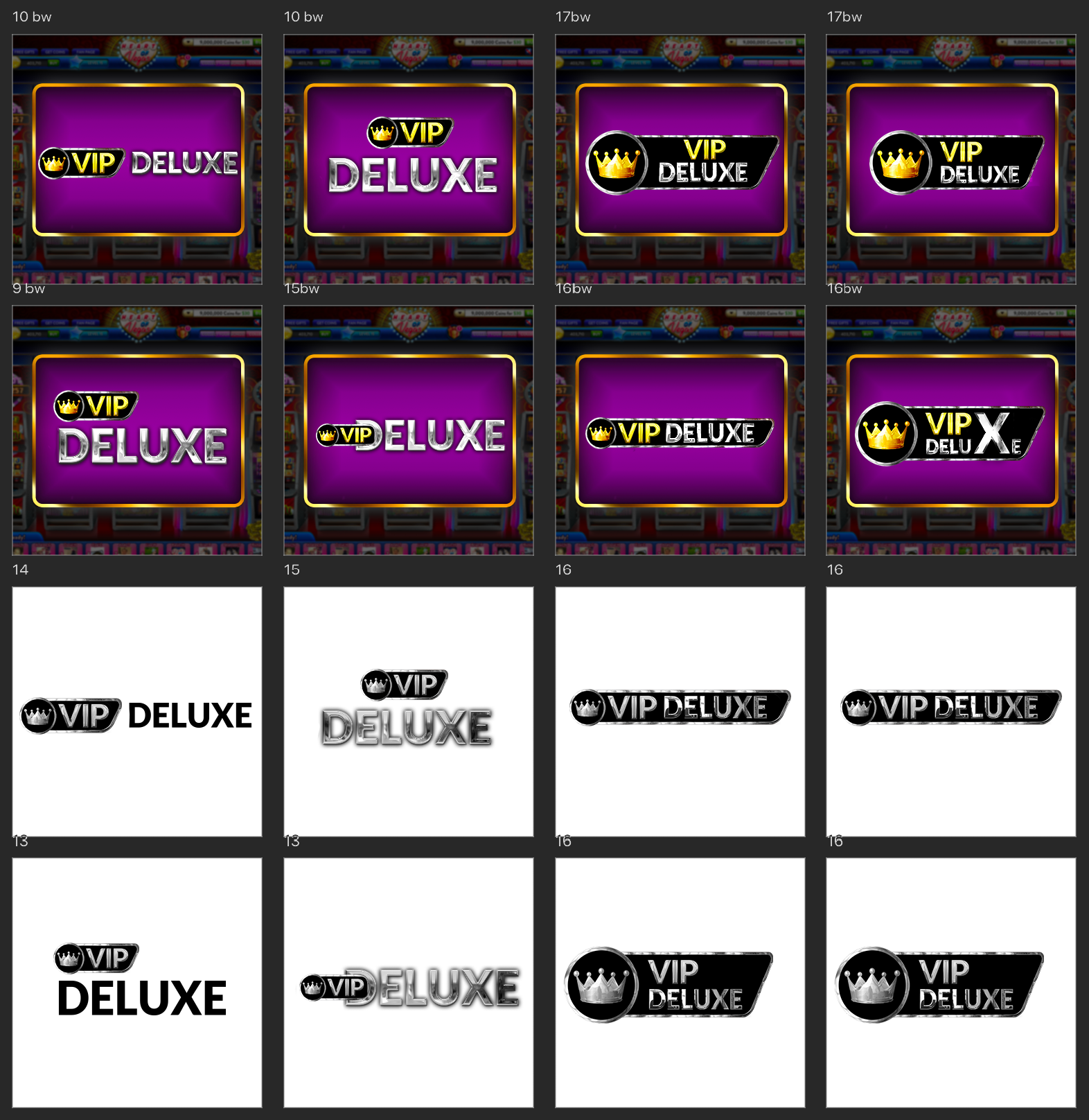
With the launch of the new designs, the VIP team wanted to create a third tier in the system—VIP Deluxe—which would sit between VIP and VIP Elite.
I drafted several variations of a logo, synthesizing the two original logos together. Ultimately, we selected one of the simpler designs that used the VIP logo as a base. The goal was to make this transition as seamless and easy to understand for our more mature audiences.
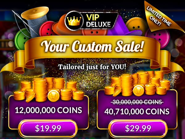
Final Logo on Mockup

Original

Rebranded
Overall, rebranding VIP resulted in a much more cohesive identity for our highest grossing users. We saw an increase in user interaction with VIP CRMs, including more participation in events and purchases during sales (120% increase in payments within the VIP program).
App Store Optimization — Holiday Feature
Premise:
App Store Optimization, or ASO, is the process of testing storefront creatives with a goal to increase app rank, page views, and installs. It is an incredibly valuable form of organic advertising.
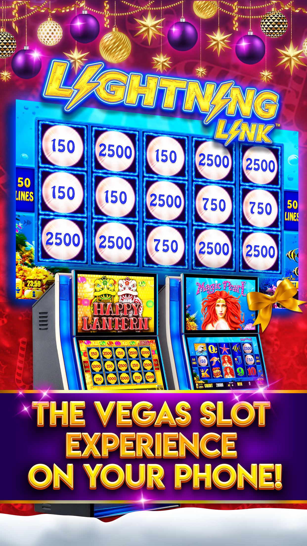
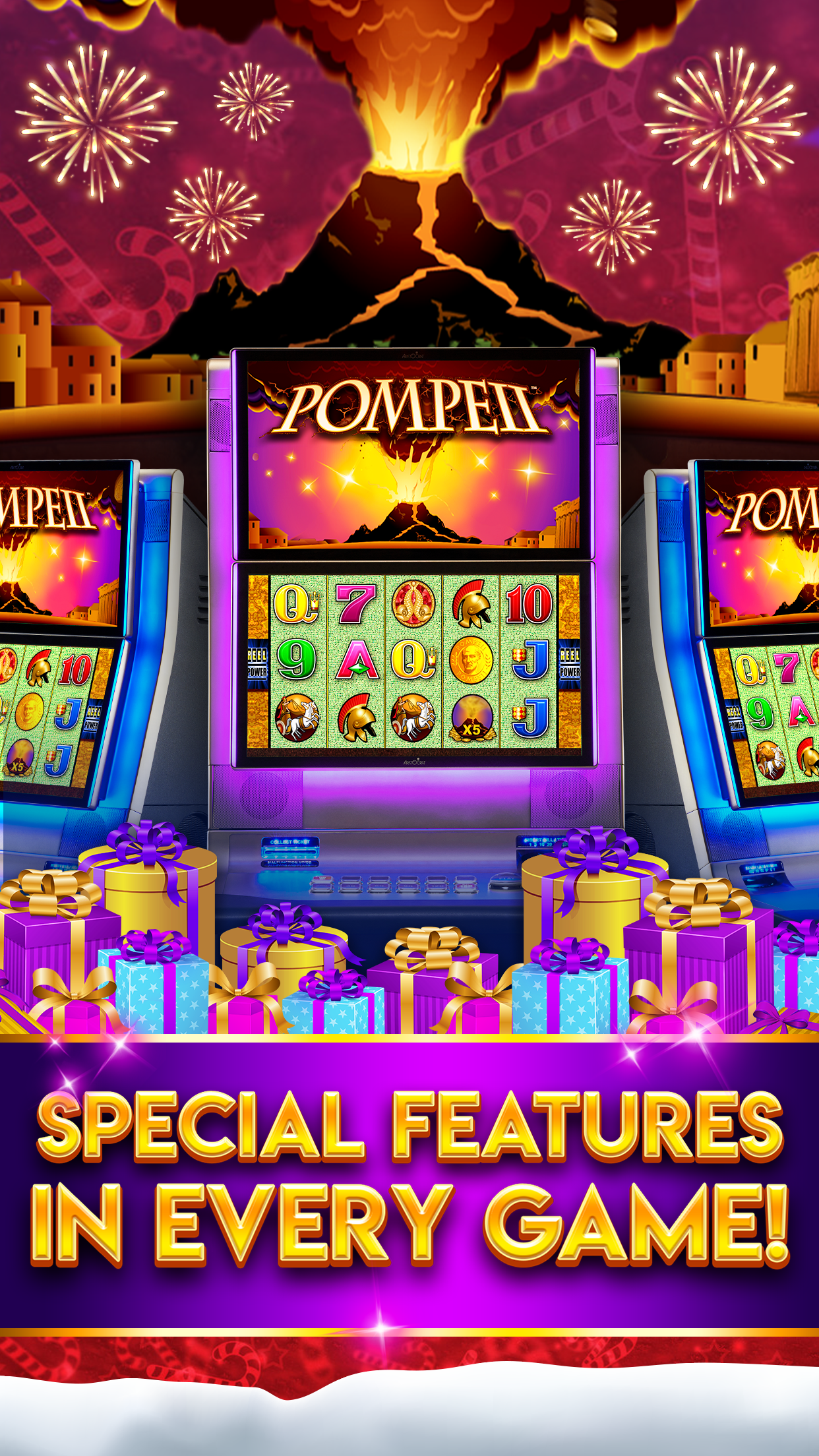
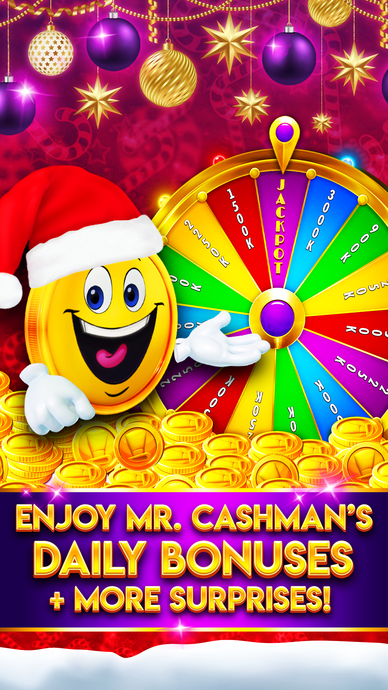
Throughout the year, the Google Play Store and App Store have features where select apps are showcased within the store. One of the most popular of these is the holiday feature that runs from mid-November through December.
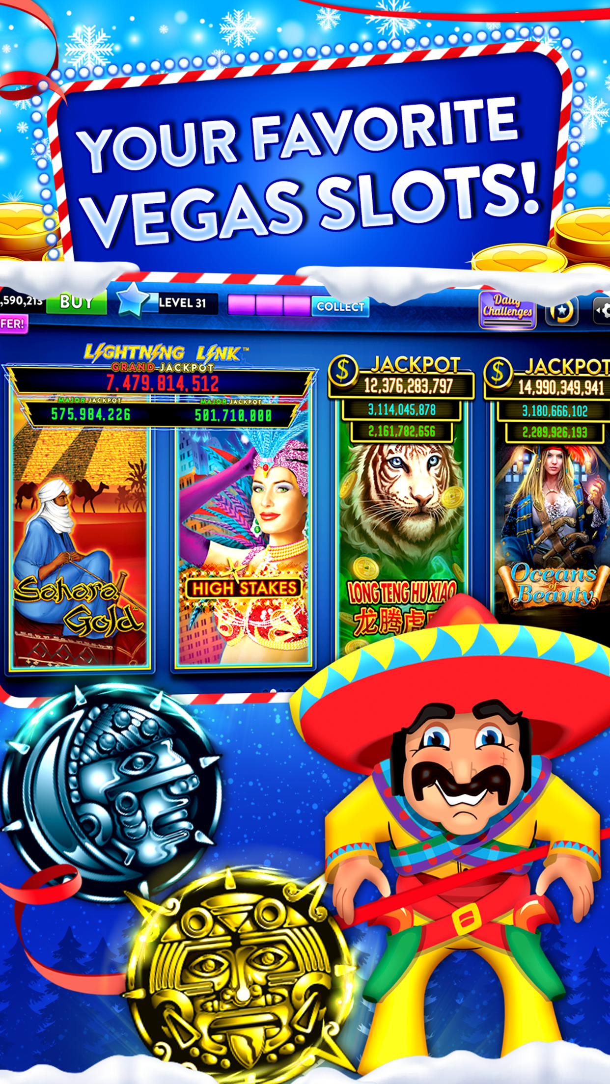
In 2018, I directed the re-skinning of our apps (performed by each app's lead designer) for the casino games holiday feature in the Google Play Store. This was a two month long process, from drafting the individual art directions to producing and launching the storefronts (Geos: US, CA, GB, AU, FR, DE, MX).
Challenge:
The main challenge with this project was combating the cannibalization of the apps, because they share many of the same popular slot machines used to advertise the app. For me, this meant finding a unique take on holiday cheer for each storefront that would set the apps apart despite an overlap in characters.
Solution:
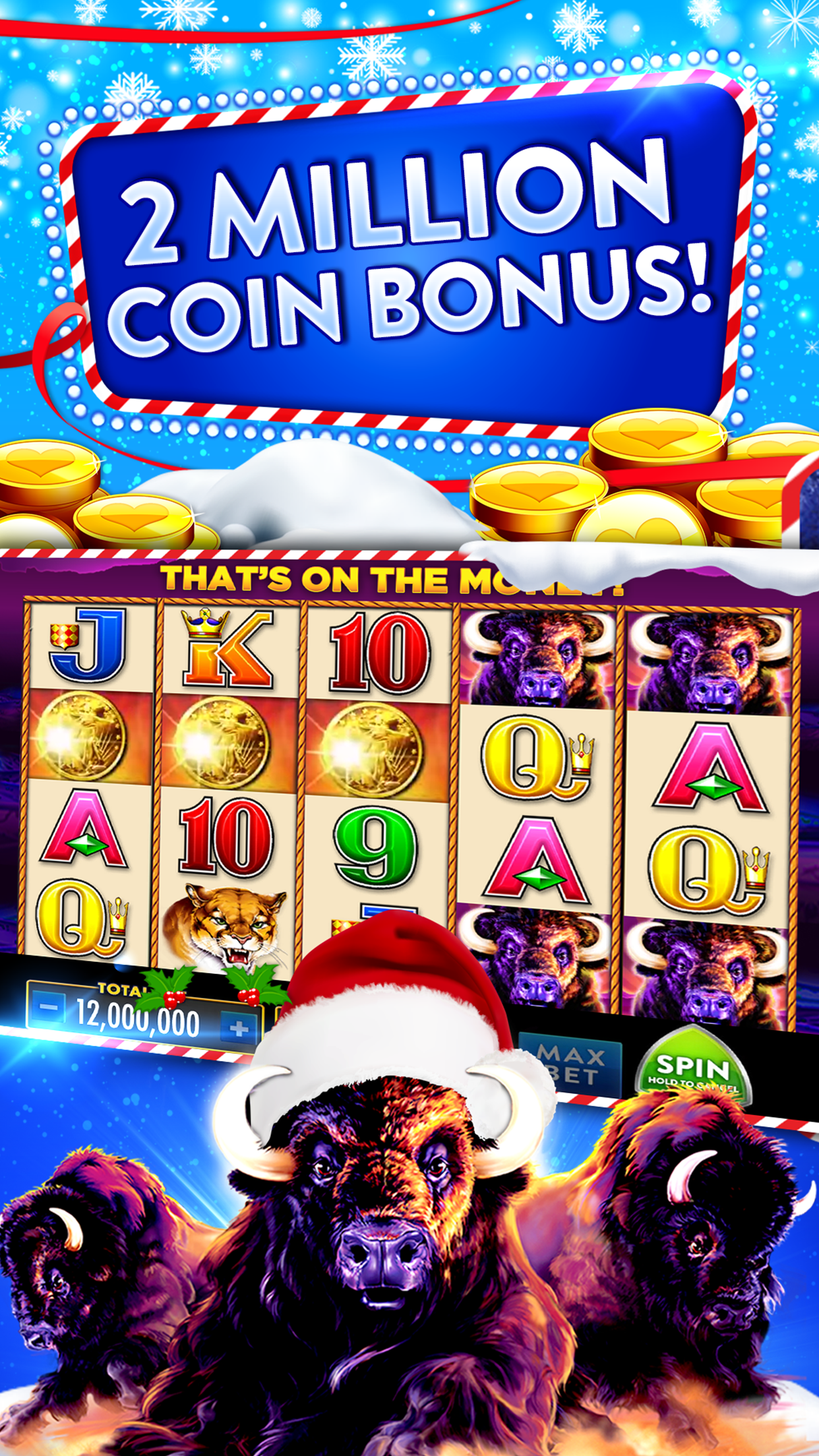
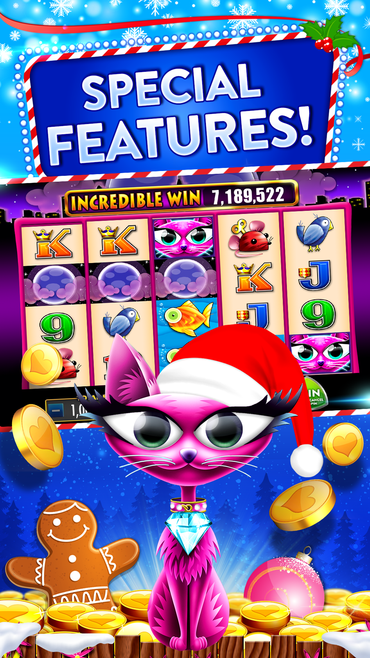
Feature Graphics, Screenshots, Icons
Heart of Vegas
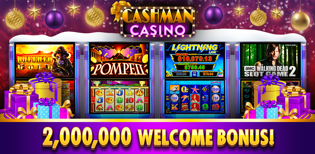
Cashman Casino
FAFAFA Gold
HOV: frosty, gingerbread, red ribbons, candy canes, shiny, clean, family-style
CMC: glowy, warm, mulberry, gold, dusky, cozy, sparkly
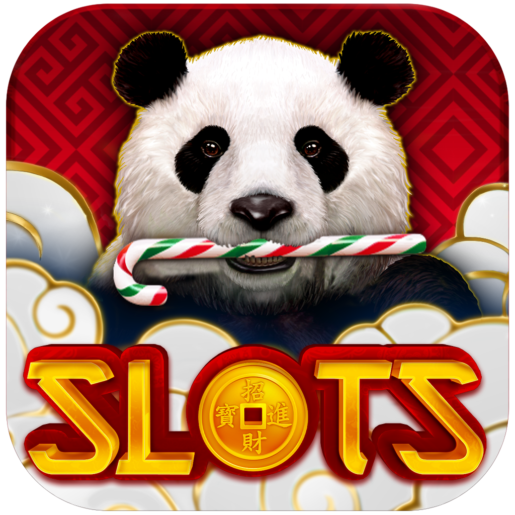
F3G: crisp, natural, mint, white, fresh, outdoors, fir trees, pinecones, cranberries, holly
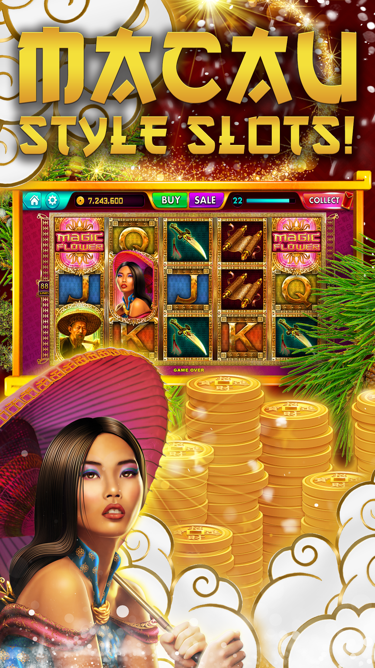
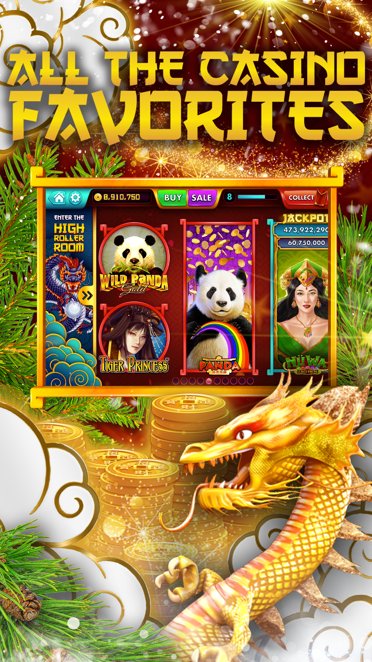
FAFAFA Gold required a slightly different approach from the other apps. Being an APAC game, the classic American holiday season did not have the same significance for the players. Instead, I chose to focus more on the winter season, with glistening snow, twinkling lights, and pandas munching on sweet treats.


Heart of Vegas' Holiday Storefront
Art Direction: McKenna Pahl
Lead Designer: Aleezay Ajmal


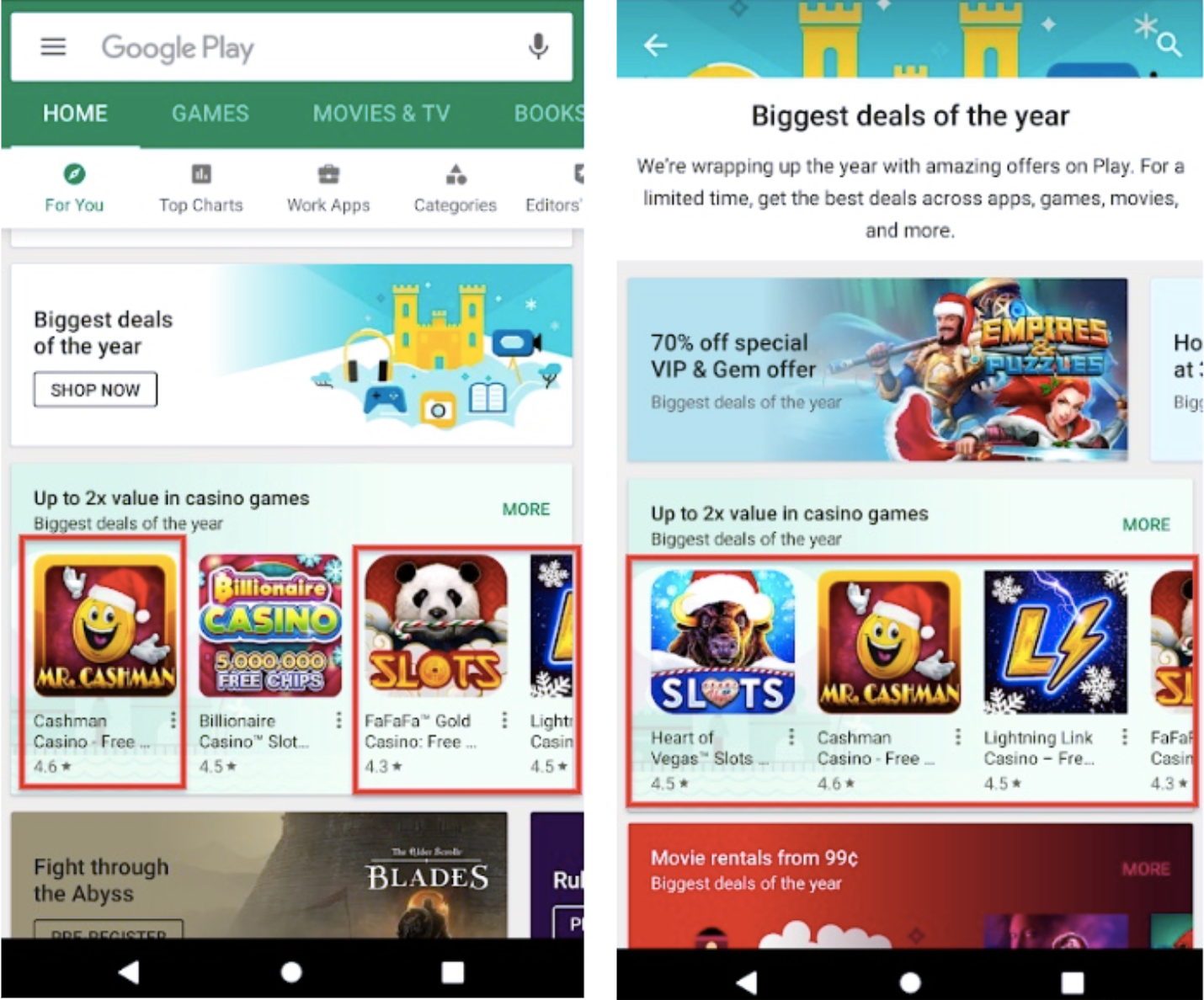
Holiday Feature
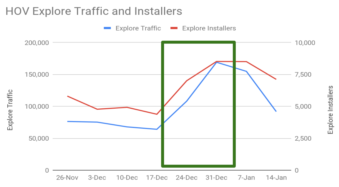
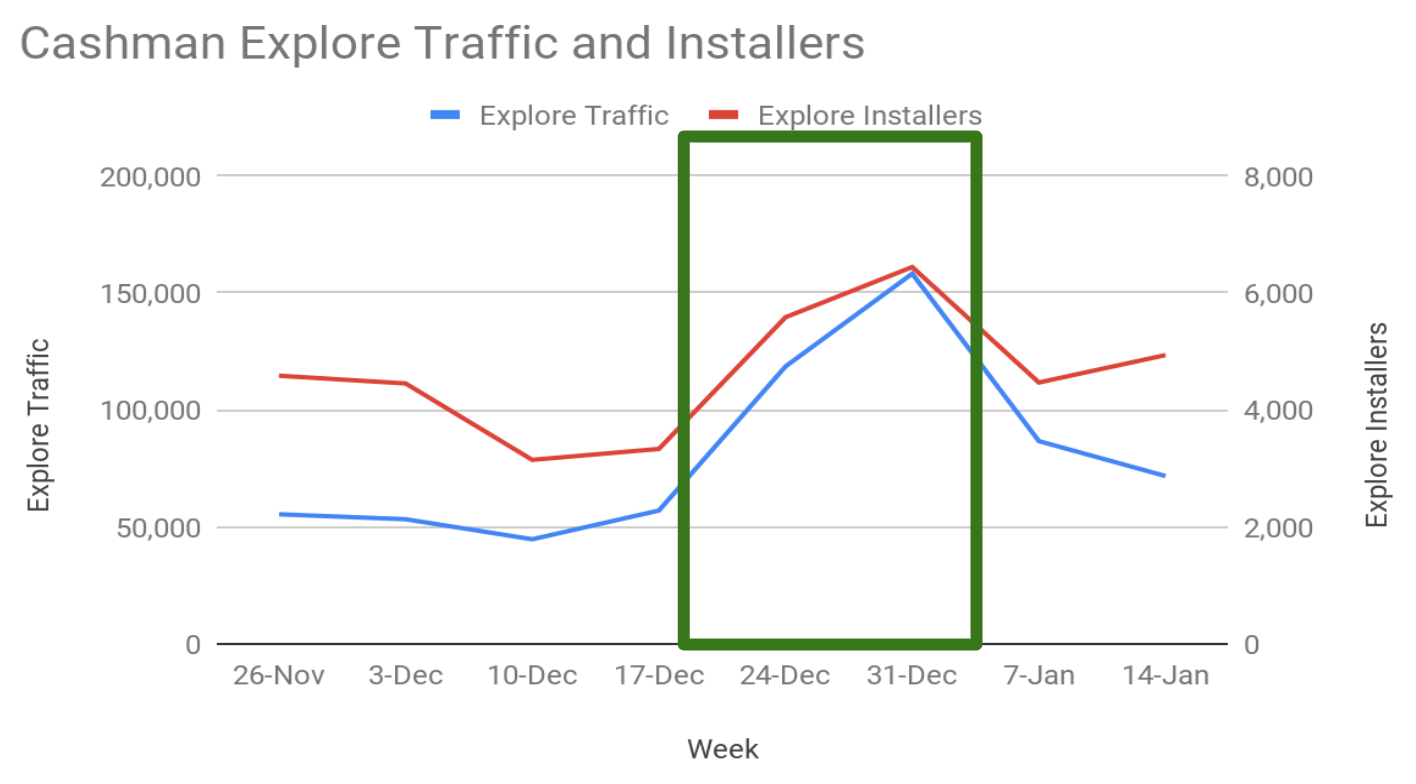
The weekly average organic browse traffic for HOV increased by 55% (73k -> 114k), and organic browse installs increased by 28% (5k->6.6k) during the featuring period vs the previous period.
The weekly average organic browse traffic for CMC increased by 117% (51k ->111k), and organic browse installs increased by 26% (4k ->5k) vs the previous period.
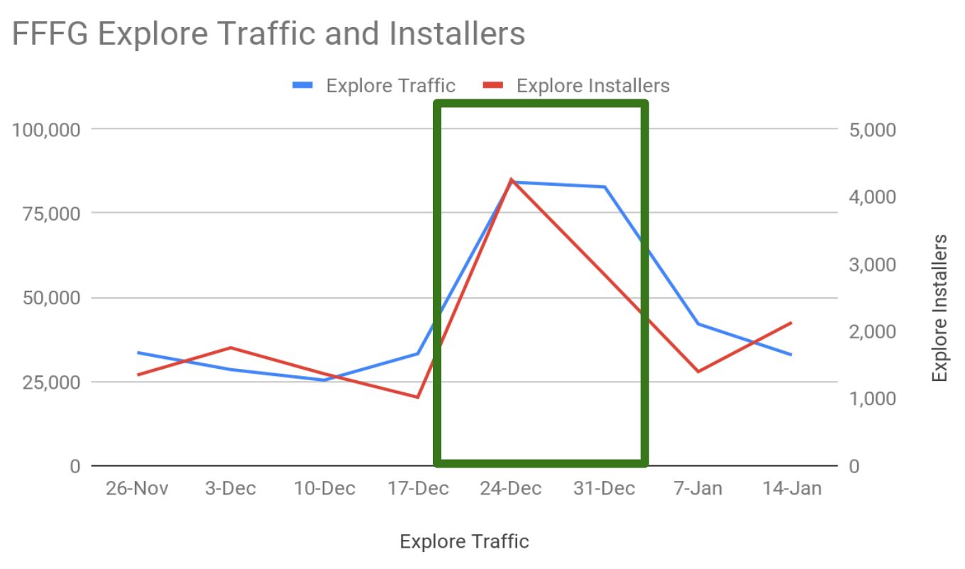
The weekly average organic browse traffic for F3G increased by 129% (22k->67k), and organic browse installs increased by 81% (1.4k->2.7k) compared to the previous period.
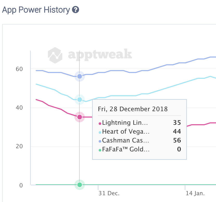
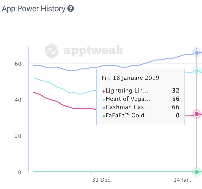
The Google Play holiday feature is know for its CVR (conversion rate) uplift potential (an average increase of about 40%), and this was Product Madness' first time participating. We saw great results all the way into January.
Motion Graphic Videos
Premise:
Each week, I produce a motion graphics video based on the performance data of past creatives and new hypotheses. These videos range from experimental concepts to A/B test, such as the last two Instagram story ads.
Challenge:
In order to identify which variables had the most influence on the overall performance of a campaign, we needed to analyze the data of large batches of creatives, with a focus on CVR, CTR, and ROAS. The solution required much cross-team collaboration between user acquisition and design, as well as a shared technical vocabulary and thorough understanding of data analysis.
Solution:
In 2018, I collaborated with PM user acquisition analysts, Juelia and Varun, to identify the data that was most valuable to the creative team. The resulting structure pared down performance data to focus primarily on testing color and functional elements (use of character faces, CTA button placement and color, ad copy, etc).
Some of the key discoveries we made based on subsequent tests, following this exercise were that CTA buttons tend to perform better when colored green vs red and that it is worthwhile to adapt creatives to their placements, such as including "content aware" ad copy like "Swipe Up!" when designing for Instagram stories.
Promotional Video for Heart of Vegas' New Feature Leagues
Jumbotron-Inspired Video for the Launch of Lightning Link Casino
Experimental Text-Heavy Video
Theatrical Video Showcasing an In-App Game's Special Features
V1 of an Instagram Story Ad
V2 of an Instagram Story Ad
HTML5 and Adobe Animate
Premise:
With the rise in popularity of HTML5 playable ads, my team began dividing time between HTML5 ads and videos. These were initially produced using Google Web Designer and Flexitive, before transitioning to Adobe Animate to facilitate Facebook's platform.
Challenge:
In order to publish a file that could be adjusted for Facebook, we needed to switch over to an entirely new program, Adobe Animate. Unlike Google Web Designer, Adobe Animate makes use of javascript and requires a working knowledge of front-end coding. In order to proceed with the transition, I needed to refine my understanding of the language, and pass this knowledge on to the rest of my team.
Solution:
With HTML5 playables still being relatively new (only recently included in the New Project window with Animate 2019), I spent some time researching the basics of Animate and non-playable HTML5 ads, piecing together a functioning ad that could then be translated into base64 and consolidated into a single file.
Once I had a grasp on the process, I constructed and led a workshop for my team on the basics of using Adobe Animate for HTML5 playable ads.
HTML5 Playable Created with Google Web Designer
HTML5 Playable Created with Google Web Designer
HTML5 Playable Created with Adobe Animate